
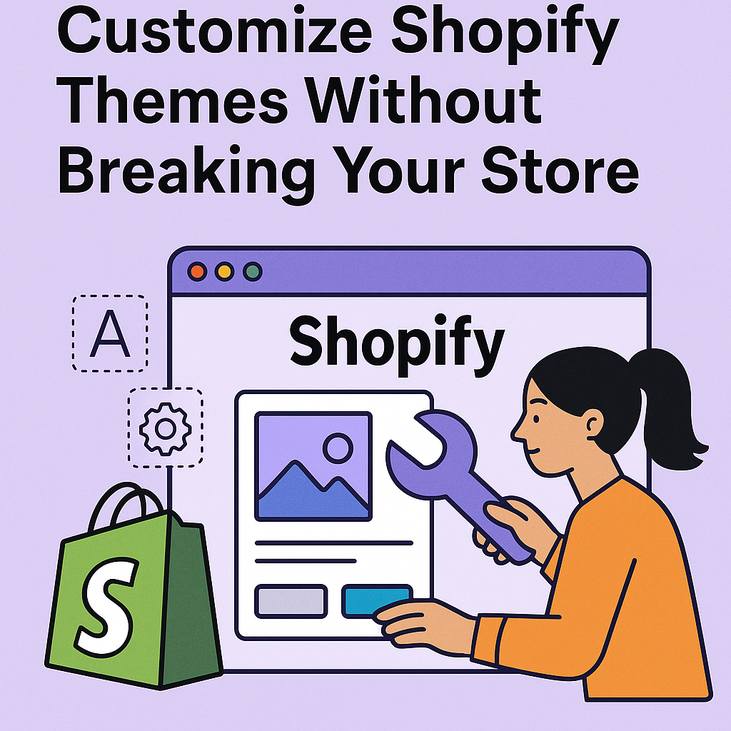
Customizing your Shopify theme can make your store stand out and boost conversions. But done wrong, it can break key features or even your entire storefront. In this guide, we’ll show you how to customize your Shopify theme safely and effectively.
1. Duplicate Your Theme First (Your Non-Negotiable Backup Plan)
Before you make any edits—whether it’s a simple style tweak or advanced code injection—always duplicate your live theme. This step isnon-negotiable if you care about site stability, uptime, and stress-free customization.
📍 How to Duplicate Your Theme:
Go to your Shopify Admin and follow this path:
Online Store > Themes > Actions > Duplicate
Shopify will instantly create a full clone of your live theme—name it clearly, likeThemeName – Dev Version orThemeName – Custom Work.
🚨 Why Duplicating Your Theme Is Crucial:
🔒 Safety Net for Edits
Whether you’re editing CSS, Liquid templates, or metafields, one error can break a layout—or the entire storefront. A duplicate gives you a safe version to test freely without putting your live store at risk.
🔁 Easy Rollback
If anything goes wrong—broken navigation, misplaced sections, or style inconsistencies—you canrestore the original theme in seconds with zero downtime.
🎯 Experiment Freely
Want to test out a new homepage layout? Add an embedded third-party app? Try a new script? Your duplicate theme is yoursandbox—play, test, tweak, iterate.
🧠 Pro Tip:
If you’re working with a developer or designer,always give them access to the duplicated version, not the live theme. This keeps your customer experience intact while work happens behind the scenes.
In short:
Duplicating your theme is like creating a time machine—you can go back anytime.
It’s the smartest 10-second move you’ll make before customizing your Shopify store.
Let me know if you’d like this turned into a visual checklist, downloadable SOP, or carousel post.
2. Use Shopify’s Built-in Theme Editor (Like a Pro)
If you’re not a developer, theShopify Theme Editor gives you deep customization power—no code required. But beyond the basics, there’s a lot more you can do if you know where to look.
🔄 Rearrange Sections Dynamically
Each section (like featured products, banners, collections, etc.) is modular. You can:
- Drag-and-drop sections to change the layout hierarchy.
- Duplicate sections to reuse layouts for different collections or promotions.
- Hide sections for temporary campaigns or A/B testing without deleting them.
This gives you full control overwhat appears where—across different pages.
✍️ Customize Typography with Branding in Mind
In the Theme Editor underTheme Settings > Typography, you can:
- Choose from a wide range of system and Google Fonts.
- Set custom font weights (like light, regular, medium, bold) for different sections.
- Define unique styles forHeadings (H1–H6), body text, and buttons.
- Match your typography to yourbrand’s tone—elegant, bold, modern, or playful.
👉Pro Tip: Use consistent typography hierarchy across pages to improve readability and user experience.
🎨 Fine-Tune Your Color Scheme
UnderTheme Settings > Colors, go beyond basic branding:
- Set distinct color palettes forbackgrounds, headers, footers, buttons, links, and CTAs.
- Usegradient overlays on hero images or announcement bars for visual depth.
- Createcolor variations for different collections or seasonal promotions.
🧠Advanced Strategy: Align color contrast with accessibility standards (WCAG 2.1) to improve readability and ADA compliance.
🖼️ Update Images & Banners with Built-in Optimization
You can easily update:
- Homepage hero banners
- Collection thumbnails
- Product grid images
- Logo and favicon
But don’t just upload any image:
- UseWebP format for faster loading
- Maintain a consistent aspect ratio (typically 4:3 or 1:1)
- UseALT text for accessibility and SEO
- Ensure high-resolution (but optimized) images for retina displays
💡 Bonus: Use Section-Based Logic
Some premium themes and 2.0-compatible themes allow:
- Conditional logic (e.g., only show a section on a specific product or template)
- Dynamic sources—pull data from metafields or collections directly into sections
- Custom content blocks that can be reused across multiple pages
This lets you build more personalized and dynamic layoutswithout writing custom Liquid code.
Conclusion:
The Shopify Theme Editor isn’t just for beginners. When used strategically, it’s a powerful design tool that allows store owners to create a branded, optimized, and dynamic storefront—without touching code.
3. Edit the Code Carefully (Without Breaking Your Store)
For store owners or developers seekingfull control, Shopify allows direct access to the theme’s underlying code. This opens the door to custom functionality, advanced layout control, and tailored user experiences—but it must be done cautiously.
🛠️ How to Access the Code:
Go to your Shopify Admin:
Online Store > Themes > Actions > Edit Code
You’ll now see folders containing all the Liquid, CSS, JavaScript, and JSON files powering your storefront.
🔍 Key Files You Might Edit:
- theme.liquid – This is your master layout file. Use it to:
- Add global JavaScript (e.g., tracking codes or chat widgets)
- Modify meta tags, title tags, and analytics snippets
- Insert global elements like sticky headers or footers
- product.liquid ormain-product.liquid – Controls the product page:
- Add trust badges, delivery messages, or metafields
- Customize the product gallery layout
- Reorder or remove blocks like descriptions, tabs, or upsells
- sections/ folder – Modular blocks rendered across your theme:
- Create reusable custom sections (e.g., FAQs, sliders, testimonials)
- Add conditional logic for different page types
- Insert dynamic sources like metafields or custom JSON
✅ Best Practices for Safe Theme Editing:
- Work on the duplicated theme – Never touch the live version directly.
Always comment your code
Example:
<!– Added custom delivery notice on 15 May 2025 –>
<div class=”delivery-note”>Ships within 24 hours 🚚</div>
Preview before publishing – Use Shopify’s Preview button to test on desktop and mobile.
Keep a changelog – Document every customization for future reference or handoff.
💡 Pro Tip:
Use Shopify’s“Custom Liquid” blocks (in Online Store 2.0 themes) to insert small customizations without editing core theme files. This keeps the code cleaner and easier to maintain.
In summary:
Editing theme code gives you unmatched flexibility, but with power comes responsibility. Back up, comment, test—and always edit smart.
Would you like this content turned into a GitHub-style checklist or a video tutorial outline?
4. Use Custom CSS and JS Sparingly (Performance > Fancy)
Custom CSS and JavaScript can enhance your Shopify store—adding animations, styling tweaks, or third-party functionality—but if overused or misused, they become liabilities.
🧩 Why Add Custom Code at All?
- Tweak theme limitations (e.g., spacing, button shapes, hover effects)
- Integrate third-party tools (e.g., sticky add-to-cart bars, carousels)
- Enhance UX (e.g., custom modals, tabs, form validations)
But here’s the catch: every extra line impacts performance, rendering, and SEO.
⚠️ Dangers of Overloading Your Theme:
🐌 Slower Load Times
Every CSS or JS file increases HTTP requests. Large or blocking scripts delay page rendering—hurting both UX and Google Core Web Vitals.
💥 Layout Breakage
A single CSS override or JavaScript event listener can conflict with your theme’s native styles or functionality—especially if themes update.
🔍 SEO Penalties
Heavy scripts can push down meaningful content, delay DOM load, and even cause CLS (Cumulative Layout Shift), negatively impacting your rankings.
💡 Pro Tip:
If you find yourself injecting CSS and JS regularly, consider creating a custom section or moving to a developer-friendly base theme (like Dawn or a headless setup) for more structured control.
Final Thought:
Custom code gives flexibility, but every line should be justified. Prioritize clean design, fast performance, and maintainability—not just visual effects.
Would you like to convert this section into a downloadable Shopify Performance Checklist or developer SOP PDF?
5. Use Metafields for Dynamic Content (Supercharge Customization Without Messing Up Your Theme)
If you want to add unique, detailed information to your products, collections, or even customers without cluttering your theme’s core files,Shopify Metafields are your best friend.
What Are Metafields?
Metafields act like custom data fields attached to your store objects—products, collections, customers, orders, and more. Unlike standard Shopify fields, they let you storeadditional, flexible content that can be displayed anywhere on your site.
Practical Uses of Metafields:
- Size charts or detailed specs: Show product dimensions or material info only when relevant.
- Extra product descriptions: Add special instructions, warranty info, or care tips without overcrowding your main description.
- Custom labels or badges: Display “Best Seller,” “Limited Edition,” or “Made in USA” tags dynamically.
- Seasonal messages: Attach holiday-specific notes or promotions per collection.
- Rich media: Store videos, PDFs, or downloadable guides linked to products.
Why Use Metafields Over Hardcoding?
- No bloated theme files: Instead of embedding every custom piece in your theme code, metafields keep data separate and clean.
- Easier updates: Manage unique content right from Shopify’s admin or via apps—no need for developer help every time.
- Flexible display: Use Liquid code or theme settings to decide where and when metafield content appears.
- Scalable: Add as many custom fields as needed without risking theme conflicts.
Getting Started:
Shopify now offersbuilt-in metafields management via the admin interface, making it easier than ever to create, edit, and assign metafields without apps or code.
Pro Tip:
Combine metafields withdynamic sections (available in Online Store 2.0 themes) to build highly customizable pages that update automatically as you adjust the data.
Summary:
Metafields unlock the power to customize product and collection content deeply—without breaking your theme or complicating your workflow. They’re the secret to a smarter, scalable Shopify store.
Would you like me to help you draft instructions or templates for common metafield setups?
6. Test on Multiple Devices: Ensuring a Flawless, Responsive User Experience
Before launching your website or application, thorough testing across a variety of devices and screen sizes is crucial to delivering a seamless user experience. Simply checking on a single desktop or mobile device won’t suffice in today’s multi-device world. Here’s a comprehensive approach:
Key Devices to Test On:
- Mobile Phones: Both Android and iOS, covering different screen sizes from small (e.g., iPhone SE) to large (e.g., iPhone 14 Pro Max, Samsung Galaxy Note).
- Tablets: Various popular tablets like iPads and Android tablets, considering portrait and landscape orientations.
- Desktops and Laptops: Including different screen resolutions (HD, Full HD, 4K) and aspect ratios.
- Other Devices: Consider testing on smart TVs, foldable devices, or gaming consoles if your target audience might use these.
Detailed Testing Checklist:
- Responsive Layout & Grid Behavior
- Confirm that your CSS media queries correctly adjust layouts at common breakpoints (e.g., 320px, 768px, 1024px, 1440px).
- Check for any layout shifts or content overflow that may break the design or cause horizontal scrolling.
- Use browser developer tools’ device simulators to quickly preview, but always validate on real devices.
- Interactive Elements: Buttons, Forms, & Navigation
- Verify touch targets meet accessibility guidelines: buttons should be at least 44×44 pixels for comfortable tapping.
- Ensure buttons, links, and form elements are easily clickable/tappable without accidental overlaps or misalignment.
- Test interactive states (hover, focus, active) across devices, noting that hover doesn’t exist on touch devices—ensure alternative cues exist.
- Validate keyboard navigation and screen reader compatibility for accessibility compliance.
- Typography & Readability
- Test font sizes and line heights across devices to maintain readability without excessive zooming or scrolling.
- Ensure text doesn’t get truncated or overlap other elements, especially in constrained mobile views.
- Verify that web fonts load correctly and fallbacks are in place for performance and reliability.
- Images & Media
- Check that images resize and compress appropriately to prevent slow loading on mobile networks while maintaining quality on desktops.
- Use modern responsive image techniques (srcset,sizes) to serve optimized images per device resolution and screen size.
- Test video and audio playback compatibility and responsiveness, including controls accessibility.
- Performance Testing
- Measure loading times and responsiveness on various network speeds, including 3G and 4G.
- Use tools like Lighthouse or WebPageTest to identify device-specific bottlenecks or render-blocking resources.
- Minimize CSS and JavaScript payloads, ensuring critical rendering path optimization for fast time-to-interactive.
- Cross-Browser Compatibility
- Test on major browsers (Chrome, Firefox, Safari, Edge) and versions common on your target devices.
- Address any CSS or JavaScript quirks or inconsistencies. Use feature detection (Modernizr) and polyfills as needed.
- Orientation and Gesture Handling
- Check responsiveness when switching device orientation (portrait vs. landscape).
- Verify gesture-based interactions such as swipes, pinch-to-zoom, and scroll behavior work intuitively without causing layout breaks.
- Error Handling and Fallbacks
- Test how your site behaves under poor network conditions or when JavaScript is disabled.
- Provide graceful fallbacks for features unsupported on some devices.
Pro Tip: Use Real Device Labs & Automated Tools
- Emulators and simulators are great for initial testing, but real devices reveal subtle UX issues, performance differences, and hardware quirks.
- Use services like BrowserStack, Sauce Labs, or physical device farms to test at scale.
Automate regression testing with tools like Cypress or Selenium to catch layout or interaction bugs early.
7. Hire Expert Help if Needed (Save Time, Money, and Stress)
When it comes to customizing your Shopify theme—especially at an advanced level—knowing your limits is a strength, not a weakness. If you’re not confident working with Liquid templates, CSS, JavaScript, or the Shopify API, trying to do it yourself can quickly lead to costly errors, downtime, or worse—broken customer experiences.
Why Hiring a Shopify Expert Makes Sense:
- Avoid costly mistakes: One wrong line of code or misapplied customization can crash your store, cause checkout errors, or introduce bugs that frustrate customers and lose sales.
- Save time and headaches: Professionals have the experience to implement changes quickly, troubleshoot issues efficiently, and ensure compatibility with theme updates and apps.
- Get scalable solutions: Experts don’t just patch issues; they build maintainable, clean, and future-proof customizations tailored to your business needs.
- Benefit from specialized knowledge: Shopify experts understand the platform’s nuances—from SEO-friendly theme structures to optimizing speed and UX—which can boost your store’s performance beyond simple aesthetics.
- Compliance and security: Certified developers follow best practices to protect your site’s data integrity and comply with Shopify’s policies, keeping your store safe.
How to Choose the Right Expert:
- Complex theme customizations beyond basic CSS tweaks
- Integrations with third-party apps or external APIs
- Building custom Shopify apps or automation workflows
- Optimizing site speed and SEO at a technical level
- Migrating data or upgrading from legacy themes
- Look for Shopify Partners or certified developers with proven portfolios and positive reviews.
- Ask for detailed proposals outlining their approach, timelines, and maintenance plans.
- Check if they offer ongoing support so you’re covered when future updates or issues arise.
- Prefer experts familiar with your theme or niche, so they understand your unique challenges.
When to Call in the Pros:
Final Thought:
Investing in expert help is an investment in your store’s long-term success. The upfront cost often pays for itself many times over through increased conversions, smoother operations, and peace of mind.
👉 Ready to upgrade your Shopify store with expert customizations?
Check out our Shopify services: https://gnosysdigital.com/product-category/shopify-services
Conclusion
Smart theme customization is key to enhancing user experience, reinforcing your brand identity, and boosting conversions. However, these benefits only come when customizations are done thoughtfully and carefully. By following the steps outlined above—duplicating your theme, leveraging Shopify’s built-in tools, handling code with caution, using metafields wisely, and seeking expert help when needed—you can confidently build a Shopify store that is not only beautiful and functional but also scalable and future-proof.
With the right approach, your store will stand out, perform seamlessly, and adapt smoothly to evolving business needs.
